
show of hands, please…who remembers the feature in the original (print) version of domino called ‘turn this outfit into a room’? the editors would challenge an interior designer to translate the elements of a chic clothing ensemble into a scheme for an entire space…it was a fun concept. when i saw this knockout powder room in style blueprint done by memphis designer jenna wallis, it hit me – i wanted to interpret her amazing look into a piece of furniture. here’s a link to her swank home, featuring the chinoiserie bathroom, with photos by julie wage ross.
renee scored a sweet old chest of drawers with (key!) the original casters still intact at a yard sale. (fact: mrs. jones adores wheels.) it wore a coat of yellow paint that popped off in chunks anytime we looked at it, so it sat in storage until there was time to strip the old paint. revelation – soy-gel stripper. it’s fantastically effective, and safe to use indoors. (we fell for it so hard that we now carry it at me & mrs. jones, though you can also order it here.)

once the old paint was off, we sealed with white shellac-based primer…it took two coats to seal in all the old stain. the chest had an old attic-y smell, so i removed the drawers and used spray shellac to coat the inside surfaces, too. paint was next – two coats of a clean white, floated on thinly with a synthetic bristle brush, with a little water added to help the paint flow.

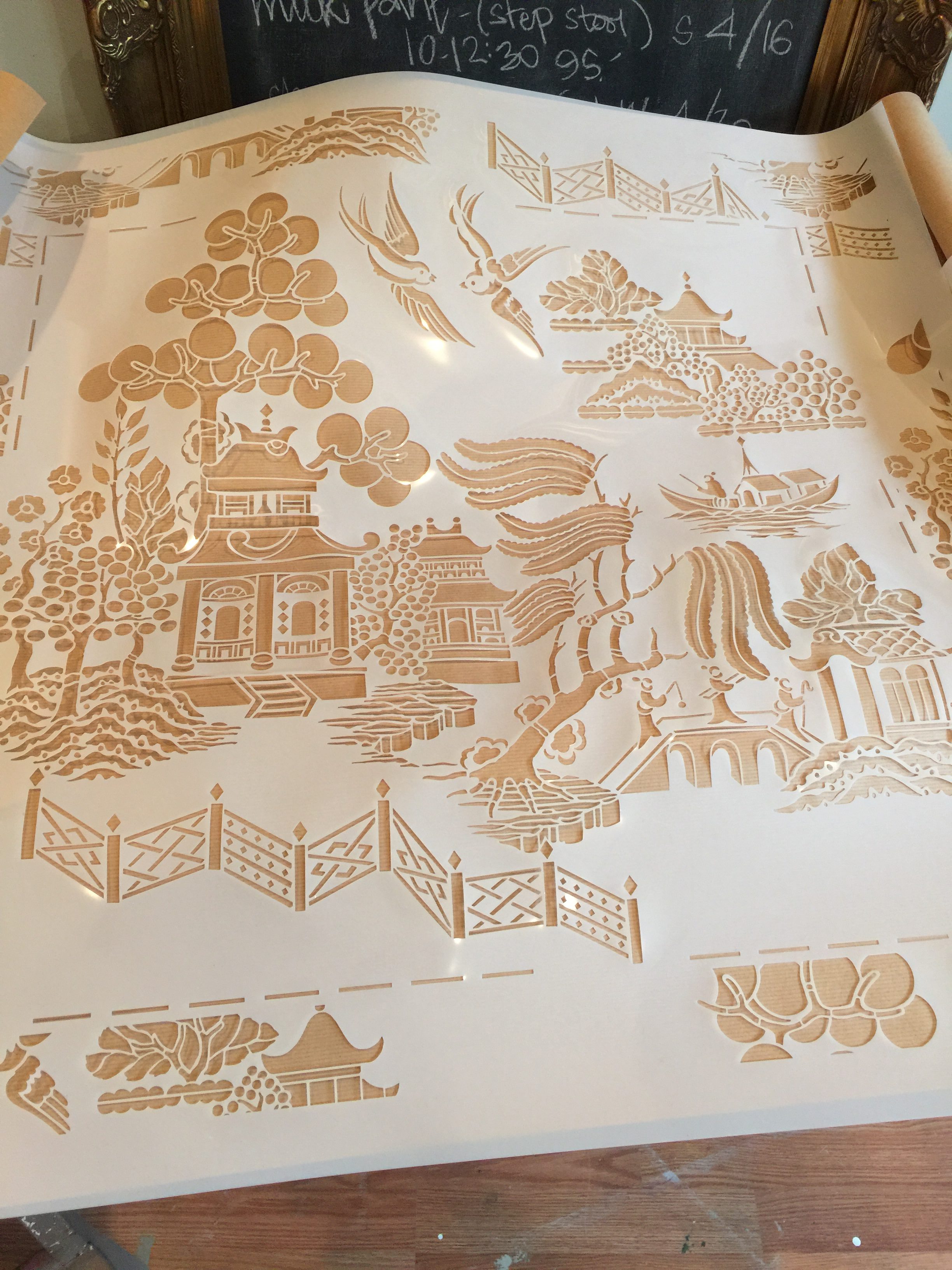
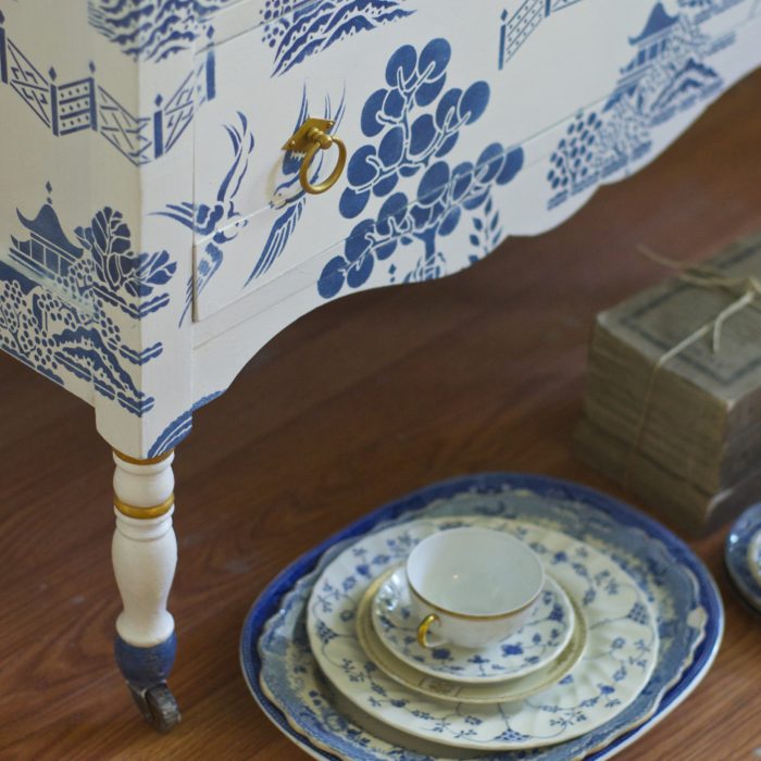
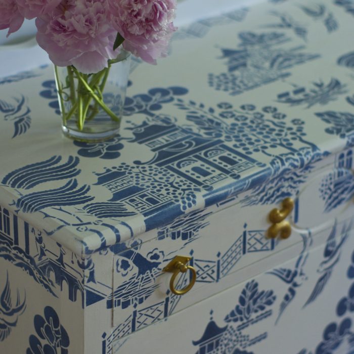
now, the fun part: stenciling! long-time readers know that mrs. jones’s all-time fave is willow pattern by stencil library. we chose a blue to replicate the china pattern. (when you’re using a distinct design like this one, it lays out best if you center the first repeat on your surface, and then work out and around, letting the pattern unfold.)

the lovely folks at modern masters asked me to takeover their instagram feed for a week this spring, and this project gave me the chance to use some of their terrific products as the final layers: first, a coat of satin varnish, followed by their two-step china crackle. the crazing is most easily visible on the blue painted areas. it gives depth and interest to the finish, and is a reference to the pattern’s origins. over that is a layer of modern masters’ tintable glaze with white pigment added. one more coat of satin varnish protects the finish.

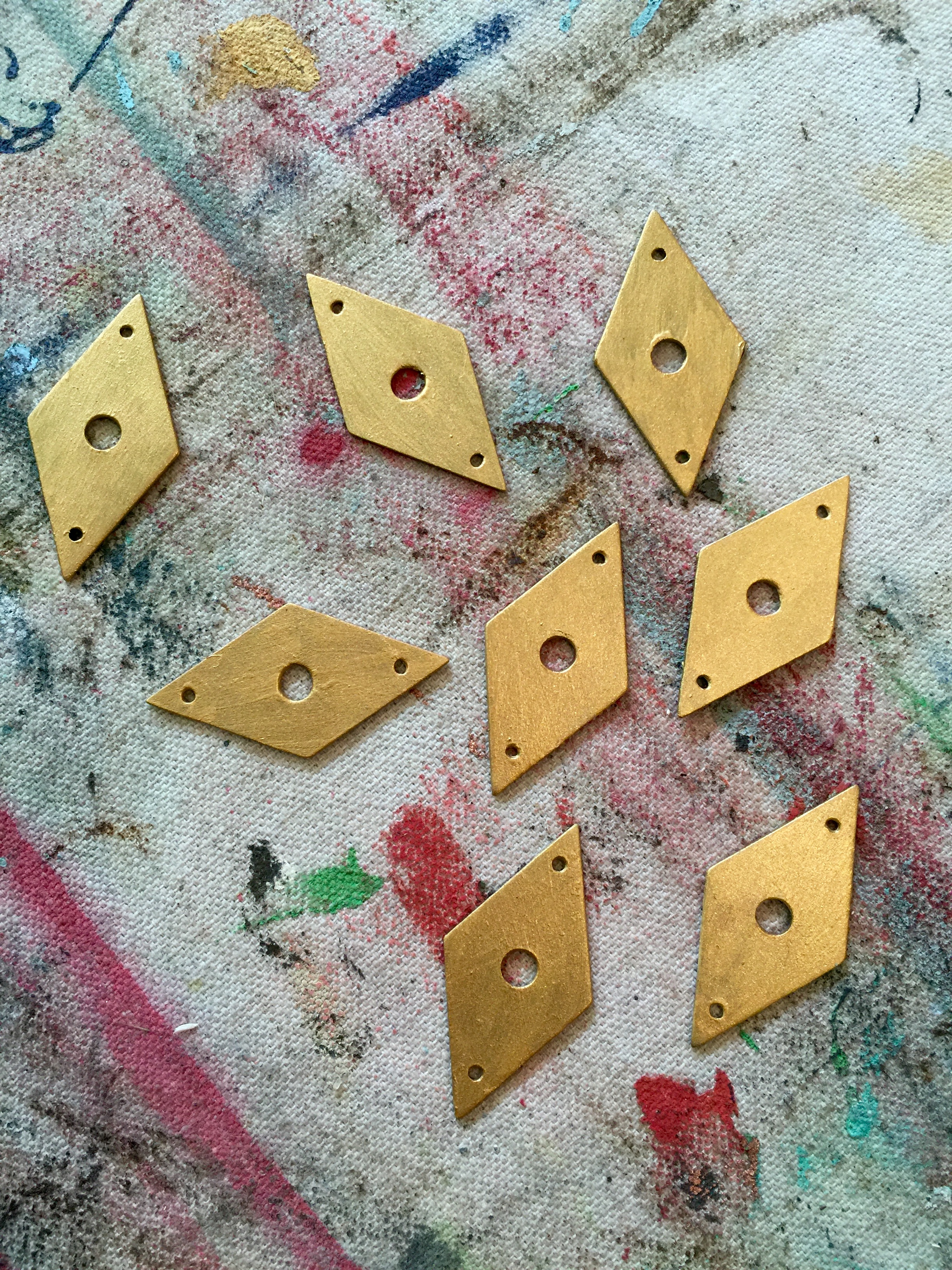
on the hardware (from home depot’s online shop – fab choices! who knew?) we used modern masters’ metallic paint in olympic gold. (tip: use a metal primer first.) i was thrilled to find ring-style pulls with the diamond-shaped backplate – it echoes the pattern found in the fence on the stencil. we also used the metallic paint to pick out the bands on the legs.

we plan to paint the insides of the drawers, but are flipping between a bright, citrus-y yellow and a deep pink. thoughts?
Jessica says
I’m voting burgundy + pure white! Love this piece! Beautiful and inspiring as always!
stephanie says
thank you, jessica! xo
Terri says
Luv this idea and inspiration. I say English Yellow to pull out related colors in the hardware.
Mrs Emma Norris says
Hi stunning I adore willow my dresser in kitchen has blue willow.Desperate get the stencil set .Beautiful work would love this in my hall I would treasure it ☺
Mrs. Jones Admin says
thanks so much, emma! xo
Angela Harland says
Oh my Goodness. I am a 46 year collector of blue Willow. This is one of the prettiest things I have ever seen. You need to bring this chest to Atlanta, GA this summer (2017) to the International Willow Collectors convention. Everyone will want it! Please post this on the IWC Facebook page. Thanks for sharing.
Mrs. Jones Admin says
thanks so much, angela! i appreciate your kind comment so much! i can definitely come to atlanta! 😉 xo
Mrs. Jones Admin says
hi angela – i tried to share it to the page, but it’s a private group and so facebook wouldn’t allow the share. you could share the link if you’d like, though – i’d be tickled! thanks! https://mrsjonespaintedfinishes.com/blue-willow-the-obsession-deepens/
bianca says
That’s a hard decision. If it’s for sale, I would wait to ask the buyer’s choice. If you’ve already painted it, what colour did you go with? Bianca
stephanie says
thanks bianca! we ended up going with the citrusy english yellow – it’s very cute! xo
Jiayi says
Love it! How did you make the steincil sheet??
stephanie says
thank you, jiyai! but, you’re giving me too much credit…the stencil is ‘willow pattern’ from stencil library in the UK. you can follow the link in the post to get there and order one for yourself! happy painting!
Helen Morris says
This is a gorgeous post Mrs Jones. I will post links to it from our blog before the weekend
stephanie says
thank you, thank you lovely helen, for giving us such amazing tools to work with! i have a client who wants the same thing but in raspberry on white…stay tuned. xoxoxox
lauren says
i absolutely love this! well done 🙂
stephanie says
thank you, lauren! xo
Tanya Morris-Rosera says
It is beautiful – I love it! I would replace the current casters with brass. Thank you for sharing your very detailed instructions and where to find materials needed.
stephanie says
thank you, tanya! i appreciate hearing your ideas! xo
mary mollman says
dear mrs. jones,
j’adore. i say jaune all the way. makes me think of giverny.
hope to see you in feb.
xo
M.
Mrs. Jones Admin says
mary mollman…jaune it is! je t’aime! can’t wait for you to see it in real life! xo
Justlove lavender says
Lovely 👍🏻😊. Thank you for sharing. Do you mind sharing the measurement of the willow pattern you used? Is it the standard size as per the website or custom size? Many thanks in advance! 😘
Mrs. Jones Admin says
thanks very much, justlove lavender! i used the stencil in the standard, off-the-rack size. i am mighty tempted to order it in a blown-up version to do my powder room walls, though! xo
TerriD says
I’ve found coral to be a great contrast colour for blue and white design 🙂
Mrs. Jones Admin says
TerriD, i agree! xo
Laurie Pearsey says
I was thinking about provence or another aqua hue.inside the drawers. Have fun with it and enjoy!
Laurie
Sharon says
I absolutely LOVE this chest. Probably too late, but neither color for the inside. Red is considered auspicious in Chinese culture. Yellow once represented power and royalty but now it is associated with pornography and sex in China. It also represents mourning. Pink isn’t a typical Chinese color, although I love paring chinoiserie with it. Great job!
Mrs. Jones Admin says
thank you so much! and wow – i had no idea that yellow was so fraught with negative meanings in chinese culture! i appreciate your comment. xo