me & mrs. jones

diy boutique & teaching studio

  • Email
  • Facebook
  • Instagram
  • Pinterest
  • Twitter
  • about
    • shop & studio
  • workshops & events
  • gallery
  • Journal
  • contact
loading...

{softly} open for business

March 5, 2012 by Mrs. Jones Admin

please don’t be blue…you have not missed the grand opening!  it hasn’t happened yet.  but with the front room (just about) ready for visitors, some of the inventory here, all my precious hens on deck to lend a hand, and people (literally!) knocking on the door for chalk paint, it seemed like the right thing to do to open the doors a few hours a week, and ease into things at the new studio. it has been wonderful to meet lovely customers from all over the region, and mrs. jones truly appreciates not only their visits but their patience too as we get all the retail bumps ironed out.

saturday, my thoughtful and industrious friends michelle and ragan “crashed” the garden at the front of the shop.  armed with an tailgate full of violet pansies (my fave!) trowels, watering cans, and the cutest blue pots – just the right color to go with the scheme – they snuck around planting and making things beautiful until i caught them:

just to give you an idea of the progress so far, here is a before of the exterior:

and the current after:

(with huge thanks to jonathan christian at signworks for his help with my fab sandwich board and sign panel, todd tice at signs first for creating the stencil for the sign and the mailbox numbers, and mark & kevin at posh for the moss in the urns.)

and here is the before:

and then the first draft of the shop…still to come: cute curtains, a chandelier, and more goodies. but so far…

(for this, i thank with all my heart my fine feathered friends cheryl, katherine, karen and catherine, without whom all this happy paint and so on would still be in boxes piled on a pallet while mrs. jones sat frozen in anticipation and fear.)

and now, off to finish custom projects for some lovely clients, call new orleans to re-order emperor’s silk, old white, graphite and louis blue, paint & clean the back rooms at the studio, sew & hang some curtains, find my adorable but elusive electrician – where is he? – and plan some workshops! see you soon.

Filed Under: Before & After, Family & Friends, In The Studio

crowning touch

February 22, 2012 by Mrs. Jones Admin

another project for rodgers menzies’ lovely client…a long-time member of a carnival memphis crewe, and (to me, at least) local royalty, it totally fits that a crown is her favorite motif. after a remodeling of her bathroom, she requested a wall treatment that included soft stripes and gold crowns.

for the right stencil, mrs. jones went straight to helen morris. who else but she, reigning stencil-designing queen of the united kingdom and beyond, could create a better diadem?

rodgers asked for glazed stripes on a ground of benjamin moore’s powell buff (# hc.35.) here is part of the room, before:

when our first stripe choice, standish white (# hc.32.), wasn’t quite light enough, i added a little glacier white, # oc.37. after taping off six-inch stripes using my trusty laser-level and 3m’s delicate-surface tape, i used a chip brush to apply the white glaze strie-style. (a process note: to make things feel nice and symmetrical on areas like the ones here around the bathtub and the water closet, start with a stripe in the center and then work out in either direction.)(and yes, you too might have to put little bits of “reminder” tape into stripes that are not to be glazed.  then again, you may be younger and more clever than mrs. jones.)

rodgers and i gridded out the spots for the crowns with little re-used bits of tape.

they went on first with modern masters olympic gold. after the paint dried, i re-stenciled each crown with water-based size, and then brushed on gold leaf. (each sheet of leaf covered 3 crowns.) a gentle burnishing to remove the excess, and they were done.

this elegant old home has some of the most fabulous fixtures…i adore that our lovely client refused to change them out.  gold dolphins, baby mermaids, beautiful marble, crystal towel bars and more are all at home here.  behold:

(did i mention she likes crowns?)

Filed Under: Before & After, Tips & Tutorials

…and a bag of chips

February 16, 2012 by Mrs. Jones Admin

only rodgers menzies could get away with handing me a gallon-size ziplock bag full of chipped paint and saying, “here you go, nancy drew!”  as you know, one does not turn down a request from the lovely mr. m., and so i packed up my glazing medium, tints, and brushes, and went to one of the most fabulous old homes in memphis to do a little detective work.

one of the dining room walls had been damaged by water, and our lovely client wanted to replicate the existing fantasy-glazed finish.  rodgers knew the base coat: benjamin moore’s dijon, #193.  working to develop the glazes from the chips of the old finish, and guided by the pattern on the current walls, i did my best.

here is a corner, before (and please excuse the color cast in this image – yikes!):

and after:

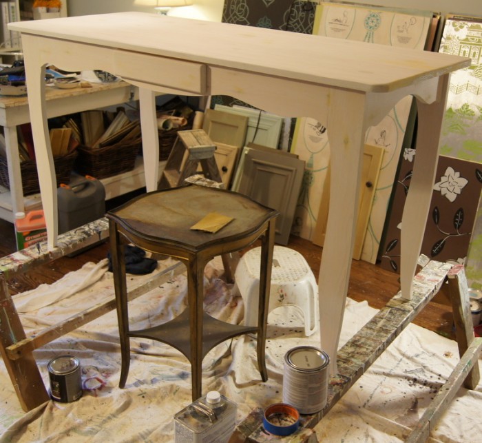
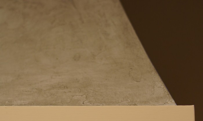
here are some other views:

not mrs. jones’s usual bag, but a very fun challenge, and for truly one of the nicest, funniest, most considerate people i’ve ever worked for.  oh, and lovely she has these fab old dining room chairs…here’s a detail of the finish:

Filed Under: Before & After

china cabinet do-over

February 1, 2012 by Mrs. Jones Admin

it’s not all put back together yet, but here is a sneak-peek of a “groovy” (my lovely client’s word) china cabinet – a must-use bequest from her mother-in-law.  despite its grooviness, the piece is very practical, and has pretty lines and is the right scale for their dining room.  not to mention the whole mother-in-law angle.   anna baskin lattimore wisely suggested a high-gloss paint job as a fix.  here it is before:

and after:

edgecomb gray (benjamin moore’s #hc.173) is on the inside, and diplomat gray (pratt & lambert’s #33.21) on the outside, both mixed in hollandlac brilliant, with thanks as always to the wonderful emmett fiore for his expertise.

(we will have a final “after” very soon, once the shelves are back in and arranged, promise.)

here is a snippet of the fab chair fabric in the foreground:

Filed Under: Before & After

the goldilocks chairs

December 28, 2011 by Mrs. Jones Admin

this pair of chairs – one more project for lovely clients of anna baskin lattimore’s – began their journey to memphis as an ebay purchase.  a series of delivery nightmares ensued, and upon arrival not only were they broken, they were sort of disappointingly bland…a reproduction walnutty kind of finish, they deserved much better.  (to add to the trouble – there is not a “before” to show you!  but you can imagine…very plain…not quite just right.)  here are some process shots:

after having them repaired, anna specified benjamin moore’s natural linen (#966) as a base coat.  (it was the first time i’ve used advance – how can a waterborne paint also be an alkyd?  apparently it can!  it is a wonderful finish, much like their impervo, which was hitherto my go-to enamel.  mrs. jones no longer doubts.  they’ve blinded me with their science.)   gold-leaf-toned gilding wax highlights the pretty curly-ribbon backs, with two layers of glaze, tinted raw umber and gray, on top.

and here they are, with new upholstered seats, finally at home:

{props to our super-lovely clients’ team: anna baskin lattimore (designer), doug enoch (architect), and frank herdzina (builder)…i have thoroughly enjoyed working in this gorgeous home over the past few months.}

Filed Under: Before & After

armoired & dangerous

December 17, 2011 by Mrs. Jones Admin

here is a pair of recent projects, both armoires (or clothes-presses, or chifforobes, or wardrobes…please choose your favorite terminology)(but not a favorite piece – i hope you will like them equally well!) and both done in shades of white, but that is where the similarities end.  so, here we go with a little compare and contrast exercise.

my lovely client wanted hers, a pretty reproduction pine press, to be very soft and antiqued.  here is a before and in-the-works (including her inspiration shot):

this was a perfect opportunity to break out some of my new annie sloan chalk paint.  after a light sanding and cleaning (we removed the old wax and sanding dust with citrus solvent), two coats of annie’s old white were applied, followed by her waxes – clear and then tinted.  the chalk paint goes on beautifully without priming, even over the knots, and leaves some yummy texture.   a little buffing, and it’s done (though not re-assembled or in its new spot yet):

this second one is a vintage mahogany chifforobe, that, though cracked, still has plenty of distinguished service to offer.  it is for mrs. jones’s own bathroom…one of the first pieces we bought as newlyweds.  found at a local junque shop, it was missing its mirror, which i replaced with brass chicken wire.  it has been in a bedroom (with gathered fabric behind the wire) hiding all kinds of things for years.  before:

early in our bathroom renovation brainstorming, selena pulled a tear sheet of a vintage-era bathroom furnished with a fancy chest-on-chest dresser that had been painted in high-gloss white.  in translating the look to our project, she immediately zeroed in on the armoire as a candidate for re-doing.  perfect size, perfect storage…brilliant!  i called emmett fiore, and he sent some hollandlac tinted to benjamin moore’s glacier white (# oc.37) on the next ups truck.   after sanding the surface lightly and wiping it down with a tack cloth (but leaving the crackled varnish alone), i used enamel undercoat followed by two coats of the lac.  here is the after, and some details:

i love the effect the glossy white has on the old varnish underneath – kind of mock croc.

the old wire locker baskets (now holding soap and washcloths) are from one of my favorite etsy shops, haven vintage.

still to come:  all the deets on the new bathroom & laundry room…but here at least you can see one the fab thomas o’brien sconces that selena chose, along with the flooring and subway tile she tracked down for us.  her (genius!)  idea to mirror the long wall opened things up in a dramatic way.

Filed Under: Before & After

home on the range (hood.)

December 13, 2011 by Mrs. Jones Admin

another week, another fun project for anna baskin lattimore’s lovely clients.  their beautful home (by architect doug enoch) features a kitchen with an incredible onyx tile backsplash and custom, curvy range hood.   after painting the kitchen’s walls a deeper color, anna and her client decided that the hood should have a little more visual heft and detail, and tie in with the tile a bit more. 

here is the before:

we decided to add some texture with a hand-troweled plaster (bella vernici’s serico).  then, color in a blue/gray (benjamin moore’s winter solstice, #1605) and two layers of charcoal-y and raw umber glaze were rubbed on.  finally, modern masters’ dead flat varnish was applied to make it wipe-clean-able and to give a matte finish.  here is the after, and a detail:

Filed Under: Before & After

party of six

December 9, 2011 by Mrs. Jones Admin

a lovely client (of lovely local designer lindley martens) had inherited this sturdy, pretty set of stickley dining chairs from her parents.  the tired-looking cherry finish had worn away in spots, and so she had a decision to make:

1. leave the chairs in the attic (where they would be subject to punishing heat and humidity, and not see the light of day – bad choice)

2. have them refinished to the original cherry (which she was completely over – so also, not a good choice)

3. have them snazzed up with paint in a fresh color, and use them in her pretty breakfast room

she and lindley chose option 3.  sporting their new hue (pratt & lambert’s anubis, #32.17) with a coat of paste wax to protect them and soften the look a bit, they are ready to go.  and go they will, over the river (literally, the mississippi) and through some woods, to their beautiful new home.  hopefully, lindley will bring back some good photos for me to share with you.  

with due respect, i took pains to preserve the original stickley labels, as well as the price tags (still on two) that revealed their purchase at the beloved old goldsmith’s department store in downtown memphis.

here they are, before and after:


excuse me now as i brace myself for a category-3 level stickley furniture-fan backlash.

Filed Under: Before & After

lucky bamboo

December 2, 2011 by Mrs. Jones Admin

here is another project for the same lovely client of anna baskin lattimore’s (keep reading for details on some sconces, and a bathroom vanity, with two more projects yet to come!)…to add a little something extra to their already-beautiful dining room, anna designed a ceiling treatment that was my pleasure to execute.  here is the room, before:

after applying a wash (made with modern masters’ pharoah’s gold mixed into plenty of glazing medium and extender)…

…over the base coat of benjamin moore’s quiet moments (#1563)…

…i applied a pattern working its way along the edges of the ceiling.  anna and i chose a few elements from stencil library’s chinese tree set, combined to echo the embroidered bamboo design in the gorgeous silk curtains.

modern masters’ rich gold was the perfect color for the stenciling…a little sheer, a little sheen.

if you would like to see one of my all-time favorite teachers, the incredible stencil designer helen morris, in action, watch this! details on her new book, stencil it, are coming soon.  in case you are not familiar with helen, she is the creative force behind the venerable stencil library.  her blog is one of my favorite places to go for inspiration.

Filed Under: Before & After

it’s raining in paris

November 24, 2011 by Mrs. Jones Admin

isn’t that what we girls (pre-spanx, when we used to wear slips)(and yes, mrs. jones is that old) would say to each other to signal that lingerie was showing?  or was it “snowing in florida”?  it has been so long since an actual slip was part of our deshabille, i can’t remember.  it was no slip, however, that my talented friend, designer anna baskin lattimore, and her lovely client chose this wonderful old wash-stand to transform into a bathroom vanity:

the only difficulty was that the old paint was not cooperating with the new plan, and so they asked me to help fix it.  here is a before (with apologies for the bad flash/lighting):

i took a drawer to seabrook, where their resident paint-matching genius, denise, nailed down the color on her first try: benjamin moore’s paris rain, #1501.  (she is the best!)  after sanding back the peeling areas, i stippled in the fresh paint, and then coated the whole piece with low-luster varnish and finally paste wax to protect it from further damage and to retain its old furniture feel.  a little tinted mylands was rubbed into the newly finished areas to give a bit of patina and bring the whole thing back together.  after:

Filed Under: Before & After

ensconced

November 23, 2011 by Mrs. Jones Admin

a pretty pair of sconces fell into my lucky, lovely client’s lap.   they were, however, in need of a tone tweak, being a little too cool and silver for her warm, yummy dining room…especially up against the gilded trim on her gorgeous antique chandelier.  a little rub & buff (lots of gold leaf, mixed with a bit of silver leaf), topped with raw-umber-tinted glaze to age them a little, did the trick:

Filed Under: Before & After

rodger(s) that

November 6, 2011 by Mrs. Jones Admin

this set of chairs came from a lovely clients’ mother’s home.  she (lucky!) is working with rodgers menzies to fab-u-lize her new house.   mr. menzies will modestly deny this, but he is (along with jimmy graham and william r. eubanks) one of the reigning elder statesmen of the memphis design community.   it was a total thrill to have him drop by and tweak the chairs as the process went along…as we tinted glazes together, he regaled mrs. jones with tales of painting and working out finishes with his friend joe niermann (in pre-niermann weeks days, when he lived in memphis, too.)  such a treat!

anyway, here is one of the chairs, before:

since the concept was to work with the original paint, job one was to cover the blue-painted medallions…it was a bit of a challenge to match the color (since it had faded to several shades of cream over time) and because this particular blue was disinclined to disappear.  since there were 14 spots on each chair that had been picked out in blue…well, you can imagine.  one other process note: for adehesion and durability (the existing finish being an oil-based enamel) i used an oil-based glazing medium.

now, getting to the after…the request being a glazed finish over the existing paint with a lot of “yummy”.  my first pass was apparently just not quite something enough…

…rodgers said (as only he could) ” honey, they are just too pristine.” he  instructed me to “dirty them up…just let it fly!”.  what do you say to something like that?  he’s the boss, applesauce.

originally, mr. m asked for a red harlequin pattern – fading in and out – for the caned backs, using pratt & lambert’s pagoda red, #5.15 (what he characterizes as a “good, old, dirty red”.)  after seeing them in the works, he decided that the pattern needed “strengthening”, and so, with a roll of my 1/4″ tape, he blocked out a new pattern for me to paint on top of the first…creating a sort-of argyle.

after that, i laid on layers of glazes – first tinted with raw umber, then grayed up with lamp black – brushed on, softened up with cheesecloth, and spattered (using an old toothbrush):

and now here they are, in their beautiful new home, with fabulously plump paisley cushions:

Filed Under: Before & After

like mother, like daughter

October 11, 2011 by Mrs. Jones Admin

here is a pair of before and afters done recently for a lovely client and her precious daughter.   she had the desk made for ellie, a budding artist, who is in the process of big-girl-ifying her bedroom.  the small side table (one of a pair) was a brilliant find my client made at a local junque shop.  both mother and daughter were after a little gloss and glam for their pieces.

for ellie’s desk – a little worried about those knots showing through – i primed with zissner’s stain-blocking primer, smoothed out the cracks and gaps (but let the grain still show) with wood filler, and then sealed the bottom, inside of the drawer, and all other unseen surfaces with clear polyurethane.  (it’s key to do this on a new piece – to seal every surface – to ensure that some parts don’t absorb more moisture from humidity than others, causing warping and/or cracking.)  after base-coating with modern masters’ silver, i topped it with a high-gloss polyurethane…ellie can now createcreatecreate, and her desk can be scrubbed clean.  she chose a pull from my grab-bag of hardware: a sparkly, rhinestone-studded number from anthropologie, to complete the look.

my client was looking for a way to add a bit of shine and light to her beautiful living room, which is full of soft, deep colors and surfaces.  she earned a gold star on her chart by researching and choosing a color…i love a delightfully decisive client who shows up with her own sample pot!  the bottom of the table was stamped and marked:


does anyone know how to interpret?  anyway, to get the gloss she wanted, i called emmett fiore at fine paints of europe.  he (obligingly, of course…he is not my crush for nothing, you know) mixed some hollandlac brilliant in her choice of behr’s cornerstone 330e.2.  after cleaning and sanding the curvy little table and doing a little repair to the filleting around the top…

…i primed it with fpe’s enamel underbody and then applied two coats of the paint.  she asked for a tiny bit of gilding wax rubbed on to some of the edges as a finishing touch.


as i was working, the combination kept reminding me of something…i finally realized it is our (old paris 2nd empire?) china, collected and given to us by my lovely mother-in-law, the original mrs. jones.

Filed Under: Before & After

fast-forward black cabinets

October 4, 2011 by Mrs. Jones Admin

for those of you loyal readers waiting patiently to see our bathroom re-do“afters”…those are coming very soon!  construction was indeed finished by labor day as frank promised…except for one key feature, the mirror.  we are now awaiting installation attempt #4.  it’s one of the simplest and least expensive elements, and yet (apparently) so difficult to get right.   as soon as it’s in and paint is touched up, i will be happy to share images and all the details with you.

in the meantime, the cabinets are done, and i thought you might want to see them.  in a room where mrs. jones (vainly, and in vain) will employ all manner of treatments and products attempting to slow down the passage of time and its toll on herself, it felt right to speed up the appearance of the passage of time on the vanity.  there you go…a little irony for your tuesday.

here they are going in:

and getting started on the finish:

after staining with minwax american walnut in their water-based formula (both for depth and to reveal color where the paint is distressed later), the next layer is annie sloan’s chalk paint in old white, thickened to what annie describes as an “impasto”.  to suit our 1940 home, and to contrast with all the sleek and cool marble and tile surfaces, i wanted the cabinets to have the look of having been painted and repainted over the years; to be crusty, warm, and slightly worn.  the impasto layer gives the look of old-school gesso, showing brush strokes (in a good way), and leaving some desirable (for this project) gookiness in the corners.

the plan was for the subsequent layers to be in ascp graphite, but even after tinting it with more lamp black, and raw & burnt umber, i just couldn’t get the exact black that i was after.  graphite is beautiful, and will definitely be the shining star in an upcoming project, but – in search of a quick solution – i turned to the tried and true milk paint that was already on hand.

{edit…2.25.12…knowing what i know now about chalk paint®, i would be able to tint it properly…but milk paint worked just fine.}

mixing it and letting it sit overnight gave the paint just the right slubby, brushy texture.  after two coats of black, the next step was to scrape a little tiny bit back off at the corners, on the edges, and near the knobs.  using more of the water-based stain on a sea sponge to soften up the paint and a putty knife, i chipped a few little spots away to reveal the layers beneath.  (mrs. sloan also recommends using sandpaper to rub back, but for this project, i went with the more surgical nip-&-tuck-type technique.)

finally, two layers of annie’s wax: clear (which has a gorgeous mellowing effect on the milk paint), and then dark brown (to complete the finish with warmth and toning, and to seal the paint up tight), with an overnight dry (memphis humidity!) in between.  while the dark wax was still tacky, rottenstone was tapped in (a la richard martin, see photo just below) especially to the grooves and corners.  the rottenstone gives an extra touch of age and grittiness, and – as a super-fine abrasive – also aids in rubbing out the wax.  several old-t-shirt buffings later, the cabinets have the yummy polished gleam of old furniture.

a drawer before and after the wax is applied and buffed (or, after and then before – sorry!):

and then, just add snazzy hardware: the gado gado pulls i craved, that selena mcadams tracked down for me.

now, to gush for just a moment: i am a huge new fan of annie sloan and her chalk paint® (which has been around in the uk for years, but has only recently become available in the united states).  for more inspiration directly from the source, take a look at her books, such as creating the french look (which actually instructs in so much more than that.  the french look, i mean.)  several finishing studios around the country are selling her complete line and offering classes and online videos on her techniques…something you will want to investigate further.  her palette, the ease of use of her products, and the authenticity of the many different looks you can acheive make her line very unique.  the fact that you can skip over a lot of laborious prep-work?  annie is staging a most welcome british invasion.

Filed Under: Before & After, Tips & Tutorials

swanning around

September 22, 2011 by Mrs. Jones Admin

though mrs. jones (preferring paint) as a rule does not refinish furniture, this gorgeous old chair from an especially lovely client’s mother’s home (with lovely rodgers menzies as the designer) was an exception.  it had been damaged (heat? water? mila kunis?) and just needed a little love to make a comeback.   challenge #1 was to match the color of the stain.  (option b would have been to strip the varnish from entire chair, and then and re-stain it with a new color…but that would have been risky, since adding more stain to the existing tone might have just darkened those areas further.  and imagine, just for a second, stripping the topcoat from a double-caned piece like this…little tiny brushes are involved, and lots of patience.  more than mrs. jones possesses.)  and so, after a good sanding, i pulled out all my cans, and the mixing began.

for those taking notes, minwax‘s puritan pine with just a dash of honey maple came closest.  hickory worked well for some fly-specking and adding the shading that the old finish had here and there.

here is the chair, before:

places that retain the old varnish don’t absorb the stain, so, after applying a pre-stain wood conditioner to ensure even-ness, i went over the piece several times with a medium-sized filbert brush and laid in the spots that needed color, building up to match the existing finish.  after the honey/pine cocktail and a final sanding, it was time to add the fly-specks (spattered on with an old toothbrush) and then to use a little thinned out stain (hickory) as a glaze in some spots.

since rattan does not absorb stain or glaze the same way that wood does, those little spots in the caning took some extra passes, but eventually blended in fairly well.  after three coats of varnish – just to make sure – it is ready to stay in the family for a long time.

the happiest moment of the delivery was when i mentioned the carved swans, and my lovely client and her daughter both exclaimed, “there are swans?”  yes, and they are back.

finally, here is the chair – sporting a fancy cushion – in its new home:

Filed Under: Before & After

  • « Previous Page
  • 1
  • 2
  • 3
  • 4
  • 5
  • …
  • 13
  • Next Page »

Upcoming Events

studio & shop

600 south perkins road
(adjacent to social boutique)
memphis 38117
901.494.8786
open hours: tues-fri 10-5, sat 10-2,
and by appointment or chance.

please note:

our germantown
and midtown locations merged in east memphis in 2019. we're on the southeast corner of perkins road and southern avenue, with parking and entry on the southern avenue side of the building. look for the ivy and black awnings!

in midtown? visit us within palladio antiques at 2169 central avenue, for a selection of your fave supplies!

me & mrs. jones is a diy boutique, workshop space, and working custom studio. we specialize in teaching and kitting you out for home projects, especially painted furniture, walls, floors and cabinets, along with stenciling, gilding and other embellishments. we offer a wide selection of diy supplies, furniture and fixtures, and locally-made goods. mrs. jones’s goal is to help you elevate your domestic space while exercising your creativity, with an emphasis on environmental kindness.


site by k brandon bell creative, with tons of photos by sélavie photography

Copyright © 2025 · Blossom Theme on Genesis Framework · WordPress · Log in