a flavor that gets a too-plain rap, sometimes a taste of pure, restful, unpretentious vanilla is just what a room needs. another piece from the my lovely client’s attic that is headed to her beautiful lake house, this little chest will sit between beds (you’ll see the much more lively headboards, coming soon.) in a guest room. it had been painted before, but not prepped or primed (oh no!), and so the old finished flaked right off with a scraper and a tiny bit of chemical stripper. now it’s covered in benjamin moore’s palace white (#956) with a little glaze for depth. here is the before and the not-terribly-different-but-much-more-durable after:
raspberry-red cocktail table
mrs. jones found this table on a recent junque-ing expedition. it is sturdy and a perfect size, but the finish was dull and nicked-up, and it seemed to want some snazzification for the next chapter in its life. wearing a fresh new combo of glossy raspberry red with bird’s egg blue tucked (secretly) beneath, it’s now available at market central and on etsy.
before & after:
the details: the red is a custom-mixed formula that my colorist crush, emmett fiore, whipped up, but is in the neighborhood of pratt & lambert’s deep cerise (#2.11). benjamin moore’s bird’s egg is #2051.60. the dimensions are 20″ wide x 28.5″ long x 18″ high.
the disclosures: the glossy finish is gorgeous, durable, and as flawless as possible, but is by its nature is unforgiving, and reveals all the little imperfections beneath. and, two of the delicate little fretwork pieces that give this table its chinoiserie flair have been slightly damaged in a very character-adding kind of way:
take me to the lake (please.)
clients of lovely lela smith’s are freshening up their weekend home, and wanted to use these side-table-ish pieces (nightstands?*) from their attic. request: a simpatico scheme using a pale green in these fabrics for the guest room:
after a thorough, varnish-removing rub-down, and then layers of pratt & lambert’s parakeet feather, #17.24, with a little linen white (benjamin moore #912) along the edges, they got some gentle distressing, and then glaze tinted with raw umber for softness.
before:
after:
and of course the minute mrs. jones wangles an invite to heber springs, there will be on-site photos for you to see. fingers crossed!….i can have a bag packed in a matter of minutes.
*extra credit: each one has these identical little holes at the back of the top shelf. what are they for? telephone cords, perhaps? anyone know for sure?
the book lovers’ club
today was all about books, and book lovers (which is really all of you, isn’t it?)…the much-anticipated release of my friend thomas jayne’s beautiful the finest rooms in america joining last week’s launch of jonathan adler’s fun two-fer, happy chic accessorizing and happy chic colors means that there is something for everyone on amazon.com right this minute.
(book cover images via amazon.com)
for mrs. jones, today also held a trip to oxford, mississippi, home to both william faulkner and john grisham (again, something for everyone…!) to give a talk for the esteemed women of the oxford book lovers’ club, est. 1934. lovely ladies, egg & olive sandwiches and iced tea, and literary-minded conversation, then lunch afterwards at city grocery…a perfect bluestocking day. thank you, book lovers of oxford, for the invitation and hospitality!
(image of rowan oak, above right, via garden & gun.)
half-moon, with boxes
here is a sneak-peek at another fairfax designs piece done this week…a beautifully crafted demilune chest that we treated to benjamin moore’s almond bisque (#269), gold banding on each drawer and on the leg details, and a coat of paste wax for sheen and protection. coming soon: photos of the assembled piece, with gorgeous gold knobs in place. until then:
and a few hints that i hope will be helpful if you’re considering a similar project…for adding lined details, if you haven’t already, you might read the straight & narrow. to create “boxes” like these, you’ll simply need to add nice neat corners. the duck “quick corners” pictured below can be difficult to find (and why oh why? they are so brilliant!) but are at some hardware stores. as an option, you can cut 2-inch painter’s tape (i prefer the 3m orange core) into squares and carefully apply those in your corners, then (the easy part) run tape between them.
when measuring, i find it helpful to tape my straight-edge at the correct spot, like this:
(it makes it so much easier on mrs. jones’s tired peepers to just scan for the tape instead of seeking the 1/4″ or 5/8″, or whichever, mark. all those tiny little lines start to kind of run together.)
another way to get crisp corners is to mask the vertical and horizontal lines separately, and fill in – once the first ones are dry, of course! – like this:
and don’t forget to burnish (smoosh) the tape down firmly on the edge that is to be painted. good luck! let me know how your projects turn out.
a banner day
well actually a nose-to-the-grindstone, prepping-&-stripping-furniture kind of day…but the in-bin this morning holds a fancy new banner for my etsy shop, created by talented meredith locklear of jack and molly graphic design…what do you think? (a enormous improvement over my hastily picasa-improvised homemade version, for starters…and just way better from there!)
and, you might notice that inventory has gotten a little thin in the shop (thank you, lovely customers!)…but there are several pieces in the works, including a pair of silver-gilded chairs and a snazzy raspberry-red lacquered coffee/cocktail table…they will be on etsy and at market central very soon.
(meredith made me a new avatar too):
minnies, mad hatters & scares, oh my!
so many cute visitors at our door tonight…
we were out of treats by 6:30!
they do, with cookies
a beautiful bride is including a charming tradition from her mother’s side of the family, and offering a cookie table at her wedding reception tonight. mrs. jones was honored to stencil a tablecloth for the occasion with the couples’ names, the date, and a fleur-de-lis in each corner…a little love for their alma mater and meeting-place, lsu. the deep orchid color erin chose was perfect for a crisp october evening’s festivities.
family and friends (including the most gorgeous & fun gang of bridesmaids!) gathered at the tower room this morning to arrange the cookies…so abundant that our carefully planned and measured-for eight-foot long table had to be expanded to 12 feet at the last minute…but no matter. it was lovely.
guests will fill these darling bags with cookies as a take-away treat. (my take-away treat was getting to know the covered-up-in-talent erin and meeting some of her nearest and dearest, including holly everett of katherine holly, her friend and photographer.)
all the best to the lovely new mr. & mrs. skinner.
the straight and narrow
over the past weeks, several lovely readers have gotten in touch with questions about pinstriping, and mrs. jones is very glad to share a few tips on adding lining details to a painted piece. but, just like at the brooklyn superhero supply company, (where the real heroes are the writing tutors on the 826nyc program in the back room) you must first pledge that you will use this information only for good, and never take it to the dark side.
now raise your right hand, please, and repeat after me: i, (state your name), do hearby solemnly swear to use this knowledge solely for the rescue of unappreciated furniture, the improvement, elevation, and enhancement of my domestic life, and the general beautification of the world.
with that formality out of the way, here goes. first, for a loose, painterly look (like the examples below) those with reasonably steady hands can get a great effect with a paint pen, or by using a sword liner or long-bristled sign-writer’s brush. a piece of tape, a length of string taped down on each end, or a chalk mark may be used as a guide, or you can just go for it. rubbing back your lines with 400-grit sandpaper or 0000 steel wool will soften them up and hide any little imperfections, and give a gently distressed look.
for a crisp, more tailored look (as pictured below), you’ll need tape, a straight-edge, small round and flat or filbert artist’s brushes, and a little more patience. measuring at regular intervals, tape off the area to be filled in. 1/4 inch thick green tape has a little give to it for rounded areas, but watch as it does not give you room for error…paint can easily end up on the other side. to hug a curve, pull gently with one hand, while pressing the tape in to place with the other. 3m “orange core” tape is excellent for straight lines. whichever tape you use, burnish the edge that will be painted along by giving it a good smooshing-down with your thumb, or, using a plastic spoon, push down with your thumb on the bowl of the spoon as you run it along the edge of the tape.
then, using just a bit of paint on the brush, carefully fill in the lines. take care to use the bare minimum amount of paint, or you will risk it seeping under the tape. you’ll want to pull off sections of tape as you go along, so that the paint does not get too dry on the edge and pull some of the lining off when you remove it.
despite your best smooshing and most sparing paint application, there will often be a little seepage. a little careful rubbing back as described above can often fix that, or a tiny bit of the base color from your piece on a skinny/tiny artist’s brush can be used to touch up those spots.
(as a guide for larger areas such as walls or bigger pieces of furniture, a laser-level will give you perfectly straight line to tape along.)
good luck with your projects! please let me know how they turn out.
pretty powder room
this lovely client has a newly-remodeled powder room that is as serene, beautiful and chic-ly understated as she is. she requested an old-furniture look for her new cabinet, and chose a yummy green scheme for a little interest. here is the before and after (which will eventually include fab hardware, and better photos):
for those of you playing the home game: the color used is pratt & lamber’s burr, #17.20, with a slightly lightened shade as a first coat, revealed in some rubbed-back spots. in the edges of the panels is a darker version of burr, along with some distressed gilding wax. over the whole thing is a little raw umber tinted glaze.
extra credit: what would you have used to seal the newly-constructed wood & mdf cabinet first?
hunters vs. gatherers
the silver lining to the cloud that is mr. jones’s often-grueling travel schedule is an overflowing hilton points account. so, while mr. j & our boys were off for a fall break trip to help manage the deer population in williamsburg county, south carolina, meg and i, clutching a coupon for three nights in a suite at the waldorf-astoria, headed to new york city. now, where would you rather be? in the damp, chilly woods at longlands, or…
…shopping fifth avenue after lunch at saks? walking across the brooklyn bridge with a mocha? sipping a shirley temple (or champagne) with your bemelmans burger at the bemelmans bar? riding bikes in central park? dancing in the aisles at memphis and mamma mia? learning what your great-grandmother’s life might have been like at the tenement museum? finding bargains at pearl river? stopping for a sweet at dylan’s? skating the rink at rockefeller center? enjoying egg creams and hot dogs at katz’s? so…hunter or gatherer?…you decide.
sanding sealer
since a recent mention, several lovely readers have inquired about the use of sanding sealer, and i am happy to share the bit i know.
sanding sealer is a petroleum-based product that can be used as a first (and second) coat on furniture and cabinets. as you know, it’s especially important to seal new wood and mdf pieces (which will absorb the water in acrylic products, and break your heart!) before painting…jobs which can also be done with primer. the differences? sanding sealer goes on more smoothly, leaving no brushmarks and raising far less grain, which is key for certain finishes. and, when doing any rubbing-back or distressing, primer would be revealed beneath the layers of paint. sanding sealer dries clear, leaving your project protected, but without telltale white or gray showing through. sort of like spanx vs. undies.
when sealing the bottom of new furniture, or the inside of a cabinet or drawer, my favorite technique is two layers of sealer – sanded and tacked in between coats – followed by two layers of minwax polycrylic, in satin.
one for the road
this elegant little chair doesn’t know it yet, but it’s about to earn its road warrior chops on a trip with furniture designer kent hughes. after a swank upholstery job, he’ll be showing it off to designers and clients in houston, san antonio and austin, texas. good luck out there, sweet chair!
here is the before, after, and details:
(the base coat, under some almost-hershey’s-special-dark-chocolate glaze to accentuate its curves, is benjamin moore’s baffin island – #243.)
meanwhile, back in columbia…
our children revere mr. jones’s home-town as the land of milk & honey. or milk, cousins, adventures, horses, hunting, hiking, sun-drop and honey. (not that chicago and tucson, on the maternal side of our equation, are anything less!) anyway, i’ve come to feel that way about columbia too…it seems that every time we go, there is something lovely going on, and we are so grateful to be included by family & friends there in all kinds of festivities. in september, mary susan and delk kennedy once again hosted a wonderful hunt supper at their lovingly tended glendale farm to mark the start of dove season:
and the polk memorial society gave their biennial dinner/dance/auction benefit at hamilton place. the ladies of the polk work tirelessly for months to ensure every creative, clever, thoughtful detail of the evening is perfect. each time, there are fab painted touches, including the dance floor in the dinner tent…this year’s was black with a red and cream border, in the same scheme as this silhouette (below, left) which marked the entrance to the ladies’ powder room/tent:
joneses heart columbia.
well, aren’t you the fancy ones?
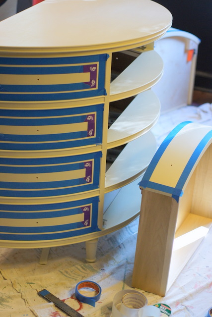
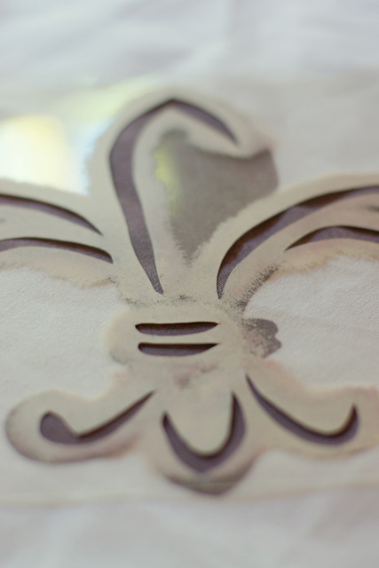
another yummy project for kent hughes of fairfax designs…this pair of nightstands got the full-on fancy treatment. after sealer, coats of cameo white (benjamin moore #915) and a little gilded highlighting, they received two layers of glaze – one raw umber, one a sort of charcoal-y gray – to give the aged, water-spotted look requested. here is before:
and after:
they were then placed into chris garner’s gifted hands for the addition of antiqued & mirrored glass inserts on the top and drawer fronts, along with hand-crafted drawer pulls, before being bundled up and shipped off to little rock:
where i hope they will live happily ever after.
- « Previous Page
- 1
- …
- 11
- 12
- 13
- 14
- 15
- …
- 35
- Next Page »