
when you arrive at 889 south cooper street, (and i hope you will, soon!) you’ll step in through a wrought-iron front door (freshly painted in behr’s rhino, #710e.30) to a small hallway that is paneled in that plastic-y stuff – you know, the man-made faux wood – popluar, i think, in the ’60’s. there have been so many remodelings over the years to the little 1922 cottage and former beauty parlor that now houses my studio & shop that my (adorable, agreeable) landlady and i are not sure when this was added. but we knew that it would be easier and much less expensive to try to camouflauge the damaged, un-fabulous walls than to float them and start over. here is what it looked like before:

so, the fix for now: prime. fill all possible holes, gaps, and dents. paint. (sherwin-williams’ origami white, #7636.)

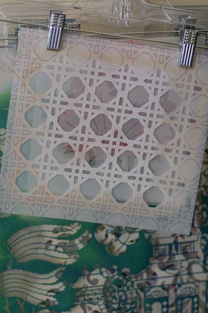
and then: use project as an excuse to indulge my obsession for blue willow yet again, enabled by a fabulous helen morris-designed stencil, willow pattern. register, paint, repeat.

(if you’ve never stenciled an all-over pattern that has a definite “story”, like this one, here’s a tip: begin by placing the stencil in the center of the wall, and then work out and around.)

to further distract you from the shape the walls are in – and to evoke the origin of the pattern – the next layers were two-step craqueleur to give a crazed porcelain effect. step 1 is applied quickly with a foam roller, while step 2 is brushed on (also quickly.)

depending on how heavily step 2 is applied, the crackle is tiny (thin layer, as on the birds) or big and alligator-like (thick layer, on the tree.)

the craqueleur dries clear, and only shows where you rub a pigmented glaze, thinned-down paint, or tinted wax over it. (fun to play with – kind of like invisible ink.) so, a waterborne glazing medium tinted with raw umber went on next, and was softened up and pushed into the cracks with cheesecloth.

once that was dry, two coats of varnish were brushed on to protect the finish….flat so as to further disguise imperfections…the bonus being that it gives the look of old wallpaper.
the interior door is original to the house, but had been covered in more of the ill-advised burnt caramel paint that coated every surface of the shop:

as i scraped back and sanded the door, i found that it had been blue, under the caramel, white, and red.

my lovely landlady is thrilled that we are now back to a shade close to the original, when her grandmother lived here. (i used a favorite blue, farrow & ball’s oval room blue, #85, for the door and the stenciling. the door is done in hollandlac brilliant tinted to match – thank you, emmett! – while the stenciling was done using part of the contents of a sample pot.
please check back soon for the final version of the hallway. it’s about to get even yummier, i hope. or better yet, drop in and see me at the coop.


 …in a box with a big, huge, sparkly, graceland-worthy bow on it, hide him in a stocking, tuck him in someone’s pocket whilst under the mistletoe, or deliver him electronically…that part is up to you. however you choose to do it, to give our


